





Moretti S.p.A. today unveils its new brand identity, a project that reflects a 50-year journey of evolution, rooted in the company’s experience in the sector of medical aids for the elderly, people with disabilities, carers and healthcare professionals.
This change stems not from a mere aesthetic need, but from a desire to represent even more authentically what Moretti S.p.A. has become today.
In the world of assisted mobility and medical devices, this evolution enables us to continue meeting people’s real needs. By listening, innovating and focusing on: closeness, safety and quality of life.
The rebranding stems from a broader reflection on the brand’s role in the present and future: to identify the company, convey its values and provide tangible support to people in times of vulnerability.
From its origins to the present day: the evolution of the Moretti logo
Moretti S.p.A.’s visual identity has evolved over time alongside the company, accompanying its growth and transforming itself along the way.

The first logo dates back to when Moretti was still a sole proprietorship under the name “Moretti Bruna”. The medical cross, which has always featured in the company logo, symbolises the world of care, assistance and support for people.
With the transformation into Moretti S.r.l., the brand evolved alongside the company, giving rise to the logo featuring the caduceus within the cross. This symbol has accompanied Moretti for decades, representing technical expertise, reliability and a strong presence in the healthcare and medical devices sector.
In 2004, the brand underwent a major visual restyling. The caduceus was reinterpreted in a more minimalist and contemporary form, whilst maintaining a strong link to the company’s history.
2026: Moretti’s new identity
The 2026 rebranding represents a profound evolution. A visual system has been created that is designed to be recognisable, accessible and contemporary.

The cross symbol remains central, but has been completely reinterpreted through softer, more rounded forms, capable of conveying humanity, approachability and continuity.
Moretti’s historic red is highlighted as a distinctive element of the brand identity: a colour that conveys energy, reliability and care within the healthcare sector.
The ‘m’ of Moretti becomes the focal point of the visual system: a distinctive, soft and contemporary symbol. The cross is integrated into the letter ‘m’, lending it support, solidity and balance.
Every element of the logo has been designed to convey the brand’s positioning:
- the soft lettering expresses humanity;
- the rounded shapes convey closeness;
- the red represents energy;
- the minimalist design conveys innovation and simplicity.
The result is an identity that combines technical expertise, professional reliability, a focus on the individual, simplicity and innovation in a brand capable of speaking to both healthcare professionals and families seeking reliable solutions for everyday life.
“With you, with care.”: the tagline that encapsulates Moretti S.p.A.’s identity.
The new tagline “With you, with care.” sums up the brand’s evolution:
- It reflects Moretti’s genuine closeness to people, carers, healthcare professionals and partners, building relationships based on listening, trust and genuine support.
- It expresses the way in which the company develops every product, service and relationship: with care, responsibility and human sensitivity.
These simple words encapsulate the identity of a brand that has been operating in the medical aids and assisted mobility sector for 50 years, always putting people at the centre.
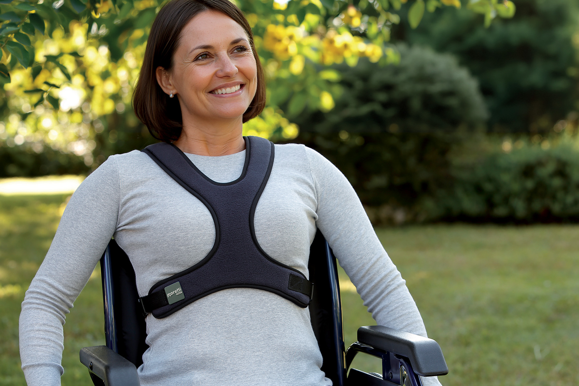
Together, life goes on
Today, the brand positions itself as a trusted partner that combines care and guidance, offering simple and safe solutions that help people maintain their independence, continuity and quality of life, whilst reducing the obstacles they face during times of vulnerability.
This vision translates into an approach based on warmth, closeness and reliability, with the aim of being a practical point of reference in times of frailty.
Thus, the new brand proposition is born, encapsulated in a simple yet powerful phrase: “Together, life doesn’t stop.”
A message that embodies the company’s philosophy: to stand by people when life slows down, helping to bring it back to the right pace with reliable solutions designed to be truly useful.
For Moretti, care means helping people and carers to maintain:
- independence;
- safety;
- continuity;
- quality of life.
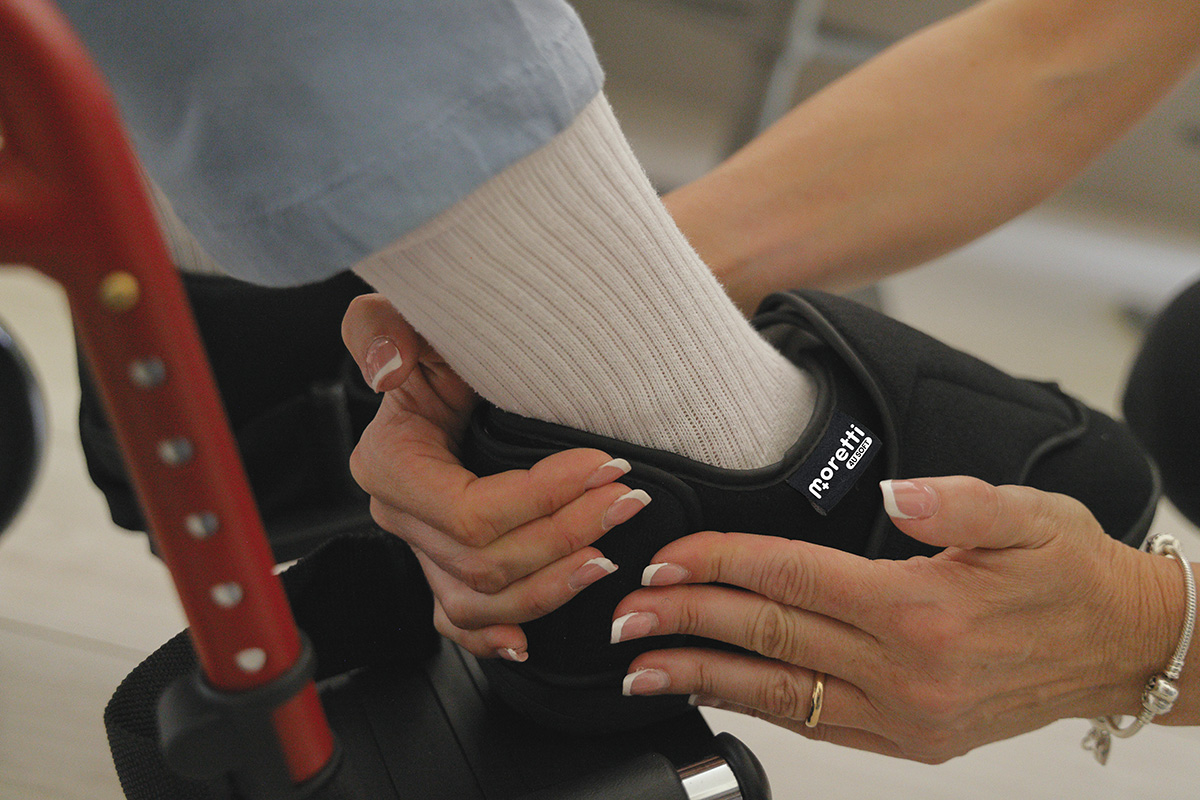
Innovation, continuity and the future
Today, Moretti S.p.A. is a leading player in the Italian and European healthcare sector, with over 5,000 products dedicated to assisted mobility, rehabilitation, home care and the everyday wellbeing of older people and those with disabilities.
With 28,000 square metres of company premises, a well-established network of partners and healthcare professionals, and over 80 employees, the company continues to invest in research, innovation and the development of solutions designed to tangibly improve people’s quality of life.
It is precisely within this path of growth that Moretti’s new identity fits, not as a point of arrival, but as a new phase of evolution that looks to the future without forgetting its roots.
Because in the sector of assisted mobility, aids for the elderly and medical devices, innovation means above all continuing to improve people’s lives.
THE SUMMARY OF A HISTORY. With you, with care.